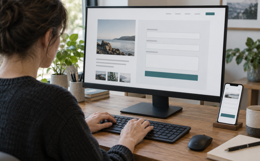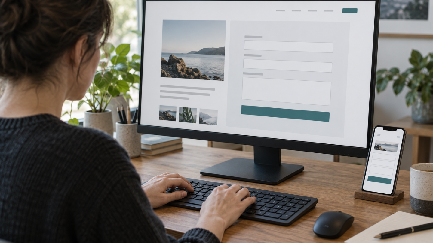
A visitor has a question, fills in your contact form and presses Send. Nothing happens. Or a red border appears without explaining what went wrong. To the team behind the website, the form might look finished: the fields exist, validation runs and submissions are processed. For this visitor, however, the route to getting in touch has stopped.
Accessibility only becomes clear when you follow the entire task, from the first field to confirmation that the message was received. These seven checks help designers, developers and product teams examine that journey. They are a practical starting point, not a complete WCAG audit.
Start with what you ask visitors to provide
Consider a straightforward enquiry. Do you really need more than a name, email address and message? Every extra field requires effort and can become a barrier. W3C guidance recommends asking only for information necessary to complete the task.
That is check one: request only what you need and identify required fields before people start. Check two follows naturally: every input needs a persistent, understandable label. A placeholder reading “Email address” disappears when somebody types; it does not replace a visible label programmatically associated with the input.
What happens without a mouse?
Our visitor reaches the first field and uses only Tab, Shift+Tab and the keyboard. Does focus follow a logical sequence? Is the active element visible? Can they change a selection and submit without getting stuck? This is check three.
Do not stop at the form fields. Cookie banners, spam protection and custom selection components can still block the journey. And an interface that looks tidy on a large monitor may become difficult on a phone with enlarged text. Check four is to repeat the task on a narrow screen and with magnification, ensuring labels, instructions and the submit button remain usable.
An error message is part of the interface
Suppose the visitor mistypes their email address. “Invalid input” barely helps. “Enter a valid email address, for example name@organisation.com” explains what to correct.
That is check five: express errors in understandable text, connect each message to its field and explain how to proceed. Do not rely on a red border alone. W3C guidance describes how detected input errors should be identified and explained in text. Preserve correctly entered information when submission fails.
For implementation details involving labels, errors and focus, see Dogteam’s tutorial on accessible form validation.
Sent does not necessarily mean received
The visitor corrects the address and tries again. A spinner appears. Has the message arrived? Not necessarily. The server may reject the request, an integration may fail or a notification may be delayed.
Check six is therefore confirmation: show success only after the system has accepted the submission. Distinguish received, processed and answered. Do not promise a response time the organisation cannot meet. In an end-to-end test, check that the message reaches the intended system.
Test the path that can fail
Check seven covers the exceptions. Submit an empty form, enter an invalid address, try a long message and simulate a temporary server failure. Repeat critical steps with a keyboard and screen reader. Record the browser, device, assistive technology and unresolved problems.
Automated accessibility scans are useful, but they cannot by themselves show whether someone can submit a question independently. Where possible, include people with different disabilities in usability testing.
Make the whole journey part of delivery
A form is not complete merely because the frontend, design and backend teams have each finished their component. It is complete when the entire journey is demonstrably usable: clear questions, associated labels, keyboard access, recoverable errors and reliable confirmation after submission.
Turn those expectations into acceptance criteria and repeat the tests after changes to forms, plugins, spam protection or integrations. The central question is not whether the Send button works, but whether visitors can complete the contact journey independently.
If submissions must be passed to a CRM or another system, delivery verification belongs in the design. Our sponsor BlazeForce describes its integration and automation services; an integration does not replace accessibility testing.
Sources
- W3C WAI — Forms Tutorial
- W3C WAI — Labeling Controls
- W3C WAI — User Notifications
- W3C WAI — Validating Input
- WCAG 2.2 — Error Identification
Contact us
Tell us how we can help; we will respond within two working days.